Halloween may still be a couple weeks away, but if you want to experience all the horror, terror and discomfort that your average slasher, giallo or monster flick can muster, just take a look at some of the truly awful examples of bad website design out there.
Atrocious site design is an absolute backbreaker for content marketers, turning away site visitors and undercutting engagement efforts before they even have a chance to really get underway. The past year has had its fair share of horrendous website designs that were just rotten to the core.
The silver lining to there being such a plentiful bounty of truly terrible website designs is that they so succinctly point out what not to do when creating or updating your own webpage so you don’t have to suffer the same fate. This “rogues’ gallery” of bad site design we have to share with you today is so heinous, it would make Batman hole up in Wayne Manor, cowering in fear and possibly even sobbing uncontrollably.
But first …
Why good website design matters
Your website is one of the first touchpoints potential customers will interact with – and, in many cases, it will be the first, so you want to be sure you make a good impression. You know how realtors are always going on and on about “curb appeal?” Well, that basic concept applies to web design. If you have a site that’s ugly, difficult to navigate or just plain broken, what does that say to your target audience? Here’s a hint: nothing good.
If you want to appear on the cutting edge, regardless of your industry, you need a website that doesn’t look like it was created during the height of the dot-com era.
Of course, “looking pretty” is only one of many important reasons to make site design a priority:
SEO
Google’s search ranking algorithms can be absolutely ruthless, but you can’t accuse them of half-assing it. They weigh a ton of variables to determine which web pages deserve to rank on the first page of search results and even attain that lofty top-three status. Many of those are directly impacted by a website’s design. Duplicate content, for instance, is a huge red flag that will assuredly hurt your site’s ranking.
Navigation
Good content doesn’t just draw potential customers to your site – it keeps them there. But if visitors can’t intuitively navigate from page to page and find the content they’re interested in, they’ll bounce. Good navigation clears away any obstacles to let your target audience effortlessly move across your website, whether they’re looking for product specs, case studies, blogs, white papers or product demos. The alternative just leads to frustration.
Site speed
Everyone wants their website to look good, but if it takes forever to load a single page, what difference does it make? Leaning too hard into multimedia can drag your site’s load times down to a crawl – and the longer it takes to load, the more likely visitors will leave. On top of that, you may have less time than you think: According to Google, more than half of mobile users will leave a page if it doesn’t load within 3 seconds.
Responsive design
Speaking of mobile, if your website design doesn’t account for the nuances of viewing content on a smartphone or tablet, you’re basically shooting yourself in the foot. Responsive web design ensures that regardless of which platform your audience uses, they will always receive the best user experience possible.
Solid website design in action
Rather than continue speaking in hypotheticals, let’s take a look at an actual real-life example of good website design, courtesy of Asana:

Why it works:
- It’s clean. Nothing is more irritating than a B2B website that’s cluttered with buttons, graphics and text. Right off the bat, you can tell that someone went to a lot of trouble to strip away unnecessary elements to give Asana’s front page a clean, streamlined look.
- It’s user-friendly. That clean look isn’t just easy on the eyes; it also makes it a breeze to find exactly what you’re looking for without jumping around different pages or hopelessly scanning the screen for information. The drop-down menu contains all the most pertinent details about Asana’s product and services (when’s the last time you saw a site put “Pricing” right in the top nav?). And look at that! It stays affixed to the top of your screen at all times, so it’s readily available no matter how far down you scroll.
- It’s mobile-friendly. Asana’s page is optimized for mobile users, with a vertical design that encourages fast and easy scrolling. Individual buttons are large and spaced out, so you don’t have to worry about accidentally pressing the wrong icon.
More B2B websites could stand to take a page from Asana’s book, but unfortunately, there are plenty that decide to make like Lindsey Buckingham and go their own way.
So, without further ado (and I admit, there’s been an awful lot of ado), let’s get into the worst of the worst when it comes to bad website design in 2018:
Sacrificing readability for creativity
There’s no question that you want to stand out with your website, but when that creative statement gets in the way of basic readability, you’ve made a major design faux pas.
The best example of this comes all the way from the Netherlands, where design studio Bolden gets a little too cute with its layout:
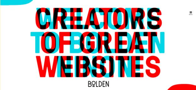
Confused? I bet. Bolden’s designers went for some kind of anti-3D effect where combining the red and blue text creates an unreadable mess. If you hover your cursor over the red and blue blobs located in either corner, the corresponding text comes forward, welcoming you to the page.
It’s clever, way too clever if priority No. 1 is just letting visitors read your website. There are a lot of different ways to showcase your company’s individuality and creativity – why not go with one that doesn’t sacrifice readability and the overall user experience?
Misadventures in color and contrast
White space is a valuable tool in the web designer’s arsenal, allowing important details to stand out from the rest of the page. But if you don’t add a hefty dose of color to contrast against more neutral tones, nothing will catch the eye.
Case in point: Typeset Design. At first glance, everything looks to be OK. You’ve got a nice autoplaying video that doesn’t detract from the page while showcasing the business’s collaborative and hands-on approach to its craft. The site’s got some verticality, so it’s perfectly navigable on mobile platforms. Not shabby, huh?
Then you get to their portfolio page …
… That sure is, uh, a lot of gray.
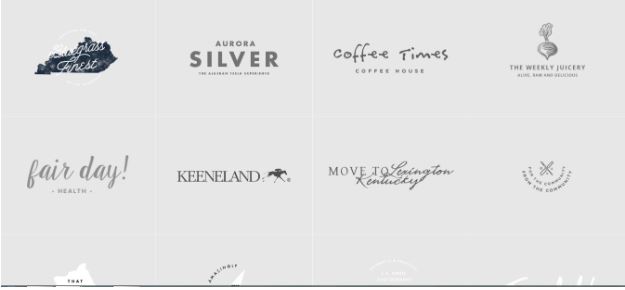
Jeez, guys, would it have killed you to add just a splash of color? When you work exclusively in neutral tones, it’s hard to make out much of anything, which is kind of a problem for a design studio to have with their website.
Missing the mobile mark
If you don’t at least consider how your website will look on mobile platforms, you’re setting yourself up for a web design failure. Want proof? Look no further than Florida’s Headhunter Hairstyling.
Whatever knowledge these stylists have about beauty and good looks, it didn’t translate to their web design.
Now, at first glance, the website doesn’t look too bad: Nothing spectacular, but nothing terribly egregious, either.
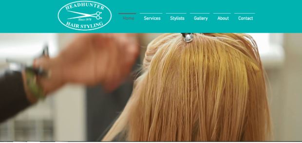
That all changes the second you take a gander on your phone. That autoplaying video of hairstyling in progress on the home page? Yeah, that doesn’t really autoplay on mobile, so much as it zooms in on a static shot of the back of some rando’s head.
Now, everyone knows that rule No. 1 of content marketing is “quality over quantity.” But a lesser known, yet equally important rule (you might even say it’s No. 1b) is “never put a closeup image of a clump of hair on your home page.” Learn it, live it.
Checking every box (and not in a good way)
You don’t expect bad website design from venerated institutions, but then Yale’s School of Art comes along and completely upends everything you know and hold dear in the world.
This site is, if we’re being generous, a mess. The seemingly neverending background image of a fluffy dog shaking itself dry is disorienting enough – and that’s before you the add in the haphazard mix of text fonts, colors and downright amateurish design choices.
I mean, just look at this thing:
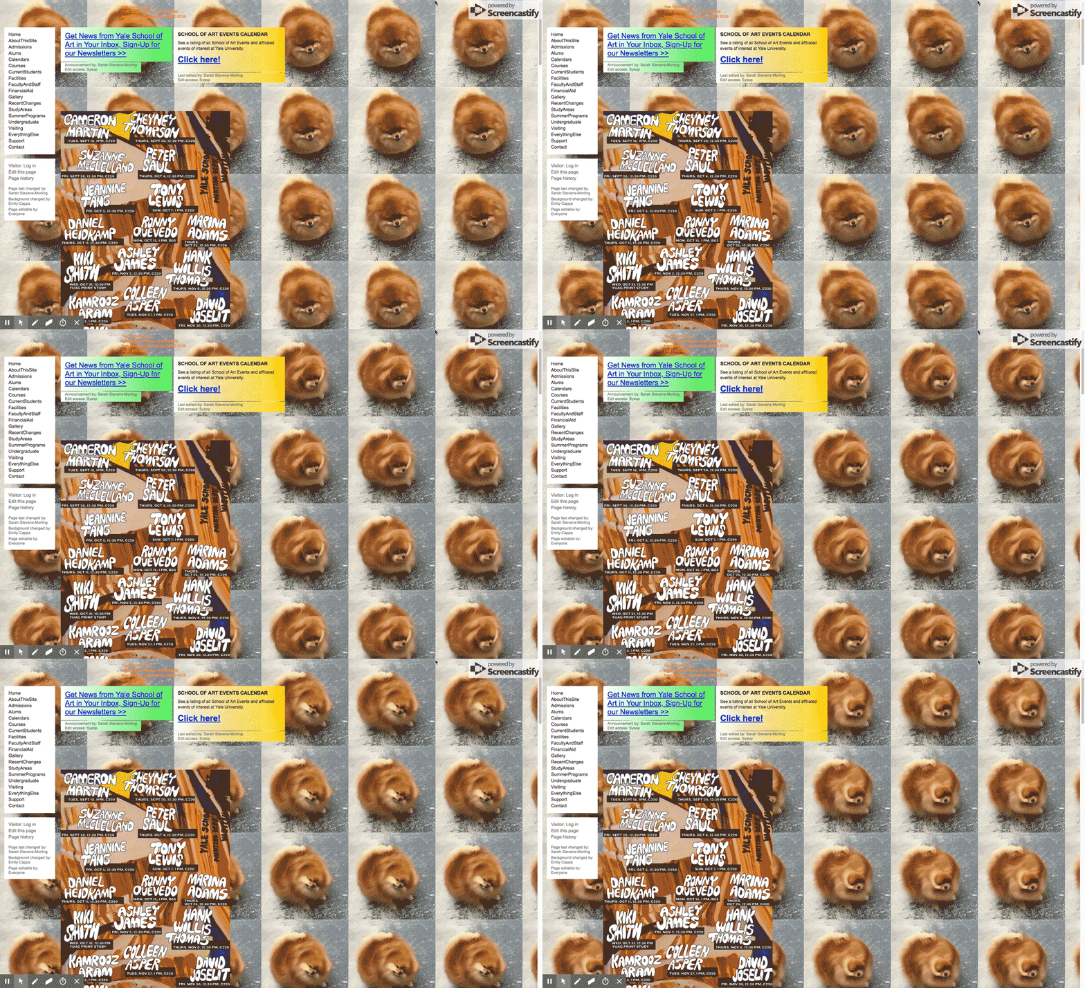
Can you make out the school’s address at the top there? Because I sure as hell can’t.
This website’s design is so bad that the only logical conclusion is that they’re trolling the rest of the internet. It has to be joke, it just has to be. Haha, good one, nerds. Now fix your site.
There are plenty more examples of bad website design to choose from, but honestly, just getting through that handful of heinous design choices was a harrowing enough experience. Man, who needs a web design pallet cleanse?
Don’t make the same mistakes that the above organizations made. Good website design is a bedrock principle of successful digital marketing, so make it a top priority. Otherwise, you’ll scare off potential customers faster than Michael Myers, Jason Voorhees and Freddy Krueger combined.


