Visuals can really pack a punch, depending upon the asset you’re designing for and how you balance text with graphical elements.
Whether you’re just starting out or you’re a pro designer, there are a few rules that you should keep in mind to take your visual elements from “meh,” to “WOW.”
First things first, we’re going over the basics – these are the rules that you should follow no matter if you’re creating a feature image for a blog, visuals to support white paper content, or a full-fledged eBook or infographic.
Consider these your cardinal design rules – standards that should only be broken in the most extreme cases:

- Abide by the style guide.
- Consider your color palette.
- Limit your fonts and choose them wisely.
- Build in negative space.
- Scale is your friend.
- Take a step back.
- Take it all in.
Now, let’s break these down, one by one:
1. Abide by the style guide
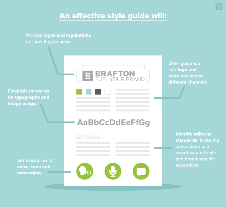
Your brand style guide (whether you’re designing for your own employer or a client) is your bible.
When in doubt, you can always fall back on the the guide.
Often, this asset will contain the company’s choices of fonts, colors and other elements that help ensure all of its visual elements are consistent with its brand identity.
Be sure that your designs don’t stray from the style guide. And if they do, be prepared to have a really, reallyyyy good reason for the decision to break away – or show your reasoning through examples (one that aligns with the style guide, and one that incorporates your own design choices).
2. Consider your color palette
While the style guide may direct palette in certain instances (i.e. the brand logo, header/footer elements, etc.), you’ll likely have a bit of artistic freedom when it comes to the overall color choice of the graphic.
Colors can convey a certain mood and message all their own – for instance, using bolder, warm colors can evoke a different response in your target audience than cooler, complementary colors.
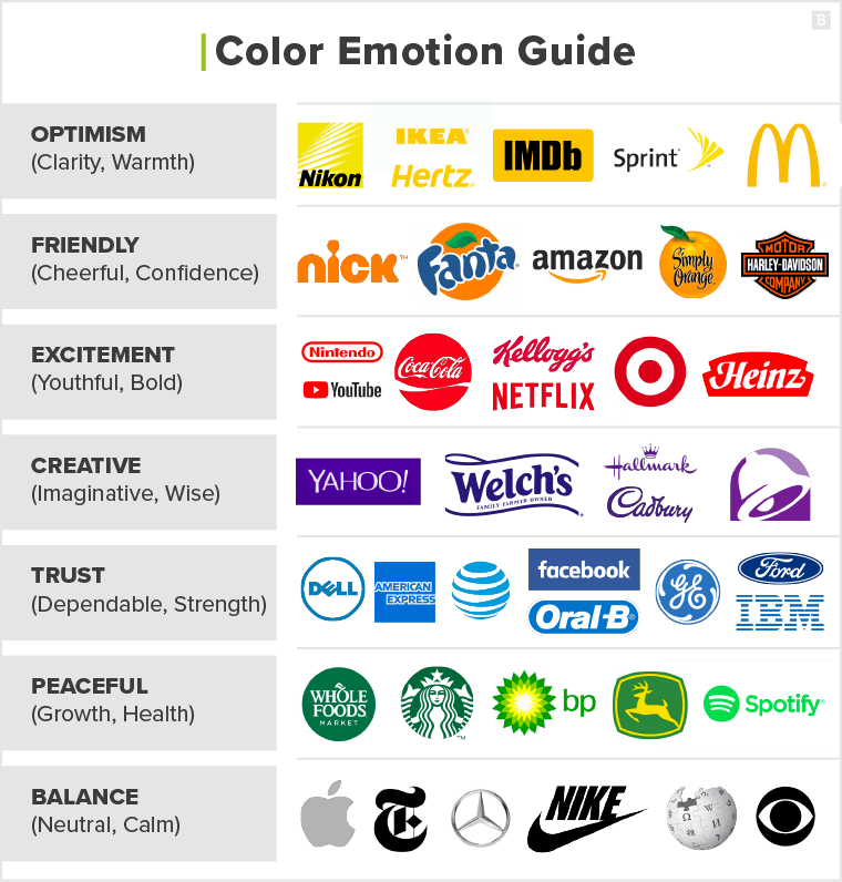
When choosing your color, consider not only the content and message you’re designing around, but the reaction you want to bring out in viewers.
You should contrasting color combinations, or those directly across from each other in the color wheel. It’s important to ensure that your palette is not only complementary, but also aligns with the style guide .
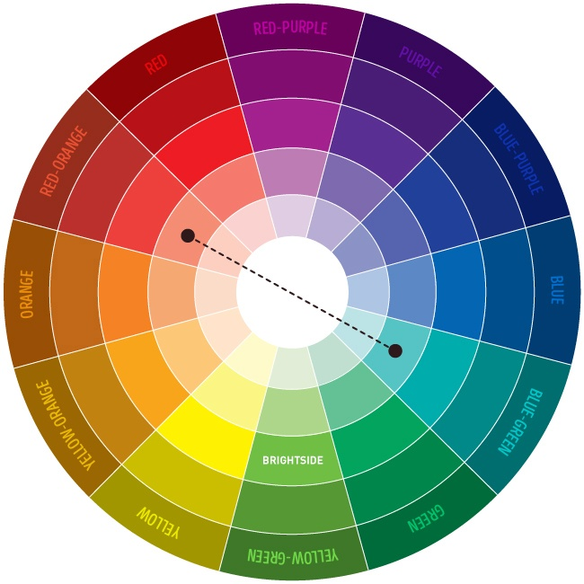
Selecting a high-contrast color palette can draw viewers in, and make your designs, well …

3. Limit your fonts and choose them wisely
Full disclosure, I have quite the opinion on typography, as you can see from this piece I wrote on email font choices.
Similar to colors, your choice of font(s) can send a message depending on the shape and size of the typeface. And if the look and feel of your font doesn’t match up with the purpose and content of your graphic, it can really throw readers off.
Using a different typeface for the heading, subtitle and any body text can be visually appealing. However, as Canva put it, for font’s sake, limit the number of typefaces you choose.
Selecting and mixing too many fonts is a rookie mistake, and can make your graphic look messy and just all over the map.
Overall, both sans serif and serif fonts are good for readability. Sans serif has become the more popular option for web content, while serif fonts are typically used for print assets. Remember to follow the guidance from your style guide, though.
4. Build in blank space
While I immediately want to make a Taylor Swift reference here, we’ll push forward.
When creating visual elements, it’s good to leave a bit of white space, or negative space, in and around your design. Consider this breathing room for your design – smoosh too much into a graphic, and viewers won’t know what to look at first.
White space can be a design element all its own, helping to direct the eye to the other shapes and visuals therein.
What’s more, building in negative blank space can help keep your graphics simple, and prevent you from going overboard with visuals or color.
Take Apple, for example, the veritable king of white space.
The brand really knows how to work blank space into its visuals, and the use of white also helps provide a clean and polished look.
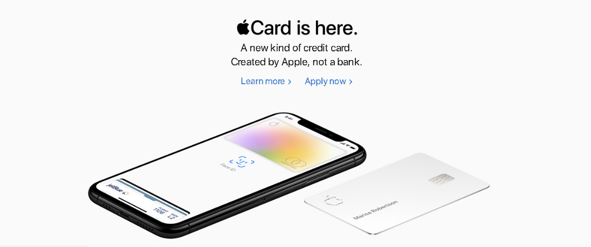
Plus, when the brand does decide to include more colorful elements, including white space around these visuals helps give them the attention they’re due.

Okay, I couldn’t help myself:

See how your eye is drawn to Tay and her shiny red apple? Blank space, people! It’s a must for great graphic design.
5. Scale is your friend
In addition to thinking about your color scheme, fonts and negative space, you should also put thought into the scale of each of these elements. Scale is particularly important when it comes to any included icons, shapes or illustrations. Giving a greater scale to certain visual elements can shake up your composition while providing emphasis in areas where it’s needed.
Using scale strategically is also a great way to help lead readers’/viewers’ eyes from one compositional feature to the next.
6. Take a step back
This is a best practice for anyone who stares at screens all day, but is especially important for designers – don’t forget to take a step back every now and then and rest your eyes.
It’s super easy to get lost in your visual elements if you’ve been looking at them all damn day.
But taking even a short break to go look at the sky or that patch of grass that your dog likes in the park is important. When you come back with fresh eyes, you never know what might jump out at you or what inspiration may come to mind.
7. Take it all in
Building off this last point, it’s also important to avoid getting tunnel vision on a single visual element, icon or shape.
Remember to zoom out and take everything in as a whole, because that’s what your target audience will be doing.
Check to ensure that your fonts, color scheme, scale and other compositional features support the content, message and purpose of the graphic. And if anything feels off, make adjustments where needed – your goal is to create something cohesive, while still providing a path for readers’ eyes.
Let’s get specific
The above cardinal rules should represent the standards you use for good design in every instance. However, as any great designer will tell you, things get a bit different when it comes to designing for assets like feature images, white papers, infographics and eBooks. So let’s drill down a bit further into each one:
Tips for feature images
Here at Brafton, we looovvee feature images.
As a writer, I can certainly attest to the power of a well-placed feature image within a blog – it takes the entire piece of content to the next level. And unlike typically non-specific (and often crappy) stock imagery, feature images can draw on information or stats directly from the text (hence “feature”).
A few tips and tricks to keep in mind with your feature designs:
- Pick an engaging fact, stat or quote to design around. I tend to prefer feature images that include statistics, because throwing your target audience a number to drive your point home is a strong strategy. However, a main talking point from the article, or in some cases a powerful quote, can work well too.
- Custom imagery or dressing up stock images? While our graphics team usually creates custom designs for our feature images, time or other factors can sometimes prevent this approach. In these instances, another route to take is to start with an image (stock or otherwise) and dress it up with some extra elements and text overlay. Like this – the designer added a blue overlay, then added detail with white lines and text.

Tips for white papers
White papers are beasts in their own right.
This long-form, in-depth informational content can span across multiple pages, but unlike an eBook (which we’ll delve into below), in a white paper, it’s the content that is the main focus.
Thus, designing for white papers can get a bit tricky.
With a few tips, though, you can take on any length white paper like a pro. Keep these things in mind:
- Use graphical elements to break up the text. Yes, the actual content is the shining star of a white paper, but no reader wants to be greeted by a gigantic block of text. Use visual elements to strategically break up the content, and consider adding in bulleted “takeaways” lists, pull-quotes, featured statistics and more. These can help break up blocks of text without taking away from the content.
- Be mindful of page breaks. With so much text to account for, it can get a bit difficult to ensure that page breaks happen naturally. However, as the designer, it’s your job to watch for and avoid things like awkwardly cramming new sections in too close to the footnotes. The same goes for weird breaks in the typography – if you can make a few adjustments to avoid hyphenating almost every word landing on the right side of a column, definitely do so.
- Choose images wisely. Keep in mind that, more often than not, the target audience reading a white paper is particularly savvy and knowledgeable. They’ve downloaded the white paper to read something more in-depth and want to come away with the feeling that they’ve learned something new. For this level of reader, clunky stock images can be a quick turnoff, so choose your images thoughtfully. Avoid the smug-looking business person, wearing a suit typing at their computer – your audience has seen this, or a version of it, a million times before, and we can do better.
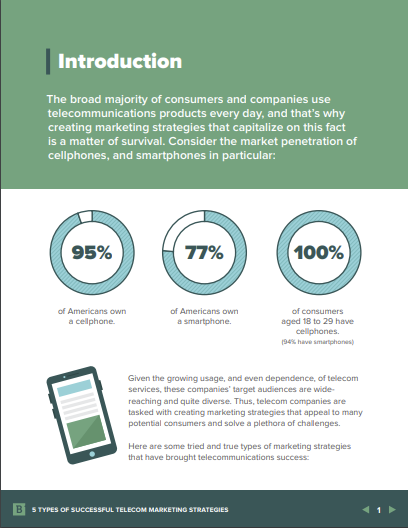
Tips for eBooks
Ebooks are like the more bite-sized, visual-heavy cousin of the white paper.
Here at Brafton, we limit the number of words per page to about 150 for eBooks – this gives readers just enough content, while providing room for the graphical elements to really shine.
When designing an eBook, keep these tips and tricks handy:
- Keep the front cover simple, yet engaging. This is the first thing your readers will see on a dedicated eBook landing page, and it serves to draw them in and encourage them to complete the form fill and download the asset. Your front cover should be bold, yet simple, and picking the ideal image, icon or other graphical element is key. B2B Marketing Lab contributor Kim Glazier recommends using a striking image as part of the front cover, but remember to keep the message of the content and the brand style guide in mind.
- Things should easily flow from page to page. Page breaks in an eBook give readers a moment to digest the content they’ve just taken in, and then head on to the next page. Unlike white papers where readers will spend a few minutes or more on each page, eBooks are shorter and meant to be thumbed through. So when you’re creating the design, make sure that things flow, and that readers will be encouraged to flip to the next page.
- Include sharable and engaging elements: Ebooks are meant to be shared, and your design should buttons so readers can easily post the content to top social networks to drive up readership. Remember, though, that sharable links should lead readers to your dedicated landing page and form fill so you can support solid lead generation.
- Mirror the design on the landing page: Speaking of the landing page, you can take cues from your eBook design to create something visually engaging. Plus, using this strategy will help make the form fill more streamlined for your target audience, as they’ll get a taste of what the eBook will look like from the LP.
- Consider trying something new: Because eBooks rely so heavily on graphics, this could provide just the opportunity to break out of the box a bit (while still observing brand guidelines). For instance, the flat design technique has gained popularity recently. Using an approach like this can encourage readership, and make your eBook stand out for your audience.

An example of the increasingly popular flat design.
Tips for infographics
In the hierarchy of graphic design, infographics just might be considered the king of the land. Infographics have exploded in popularity recently, and readers really appreciate being able to see so many facts, beautifully designed in a single asset.
- Show, don’t tell. This means that writers should keep text to the bare-bones minimum, as you’ll be using graphical elements to drive the main points of the graphic home. A statistical fact supported by an icon, for example, is all readers will want from the graphic.
- Don’t go overboard. This includes text content and graphical elements. This is one of those things that’s hard to explain, but you know when a designer has taken things a biiiit too far when you see it:

As Neil Patel pointed out, the above example could have easily been four or more separate graphics. Your eye doesn’t know where to go first, and while the recognizable brand icons help, this graphic is all over the place – what do those dots mean? Why are they different sizes? There’s also a bar graph at the bottom?? As a reader, I wouldn’t even take the time to begin deciphering this.
- Go with a theme: This can help inform your choices for color, font, icons, shapes and more. Take this Brafton example, for instance (which also just happens to be about infographic best practices :

The recipe/ingredients theme here ties the content together. The numbered items and dash-line border help to keep everything distinct, yet simple. The reader’s eye is drawn from point to point without being overwhelmed.
A theme is a crucial element that can take your good design to great. Check out the rest of our best practices here.
Learning resources
While the above is certainly by no means an exhaustive list of tips, tricks and best practices, it can help put you on the path to great design work.
When you’re ready to brush up a bit further, check out some of these top educational resources:
- Niice – the place to go for inspiration.
- Design Taxi – for trending graphic design industry news.
- Adobe Color CC – helping you pick an appealing color palette.
- Noun Project – for all things icons.
- FontSquirrel – 100% free fonts, ready for use.
Get out there and take your designs to the next level.


