Let’s talk about WordPress: My only experience with the site before going into marketing was teenage blogging – and let’s not discuss those days. It was a bit scary to jump back into the platform now with a professional mindset but that fear disappeared soon enough — because WordPress has changed quite a bit from back then!
Now there’s the Gutenberg Block Editor, named in honor of the inventor of the printing press, Johannes Gutenberg. The reasoning behind the name is to drive home how big of a change this is. “It’s time for WordPress’ next big thing, the thing that helps us deal with our challenges and opportunities. The thing that changes the world”, explained Matt Mullenweg himself.
When first launched, “Gutenberg” referred to the various components of this new, updated WordPress. Now that these updates are fully rolled out, the updated editor is simply called “the Block Editor.” It was first launched as a plugin back in 2018, but now it’s the editor that has replaced the classic version. Here’s what the Classic Editor, which still exists, looks like:

And here’s the new Block Editor:

I freeze up when I see lines and lines of code, even if it’s obvious stuff once you take a closer look (like font formatting). So if you’re a more visual person trying to delve into the world of blog publishing and page building, this more visual and intuitive layout is a godsend. That’s not to say the Classic Editor didn’t have a visual mode. It just didn’t look as easy – to me – to understand what’s going on there.
Now, the Block Editor is the standard editor type, and WordPress has discontinued support for the Classic Editor in 2022.
As you may infer from the name, the Block Editor is all about blocks nested into more blocks. Basically, a Matryoshka doll of blocks. How do they work, exactly? Here are some examples and to show them to you, I’ll use this very own article.
Important disclaimer: This is based on my own experiences with WordPress as a casual user who isn’t adept at coding. For each person, playing around on the platform will be a different experience.
Blog Posting with the Block Editor
When I first started out, publishing blogs was my first task on WordPress. Blogs are easier to build than full-on landing pages and usually have a smaller variety of blocks. Here at Brafton, the writing is usually done outside of WordPress, but it’s just as easy to write on the site proper (though be warned that very long blogs with lots of imagery and videos tend to lag, especially in the Block Editor mode).
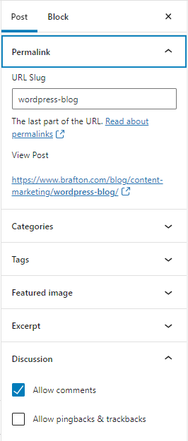
Before going into the text section, never forget the right sidebar, especially if you tend to hide it (like if your screen is tiny, like mine). Some very important settings there are:
- Author.
- URL.
- Blog categories.
- Tags.
- Excerpt (meta description).
- Featured image (blog headers).
These settings pertain to the published blog as a whole. As you add blocks to your piece, you’ll get different sidebar options for specific blocks, such as:
- Text settings: style, typography, formatting, HTML anchor and CSS classes.
- Image settings: sizes and alt text.
Blog Blocks
Like any word processor, you can just start typing if you want a text block. And to add another block? Just click on any of the multiple plus signs:

Once you click on the block, the menu is also right over the block you selected.

When copying this blog’s content from a Google Doc (as long as I formatted everything as I wanted in the doc), everything is pasted accordingly. The H2s and H3s remain as H2s and H3s and any text formatting looks the same. What’s interesting in the Block Editor is that each paragraph is its own block. If you select an image, that’s another block. This makes it very easy to visually select and change what you want.
The text block type is pretty straightforward. What I especially like is that I can just paste a media type (image, video, social post with a plugin) and it automatically becomes the correct media block type. For example, pasting this URL gives me this block:
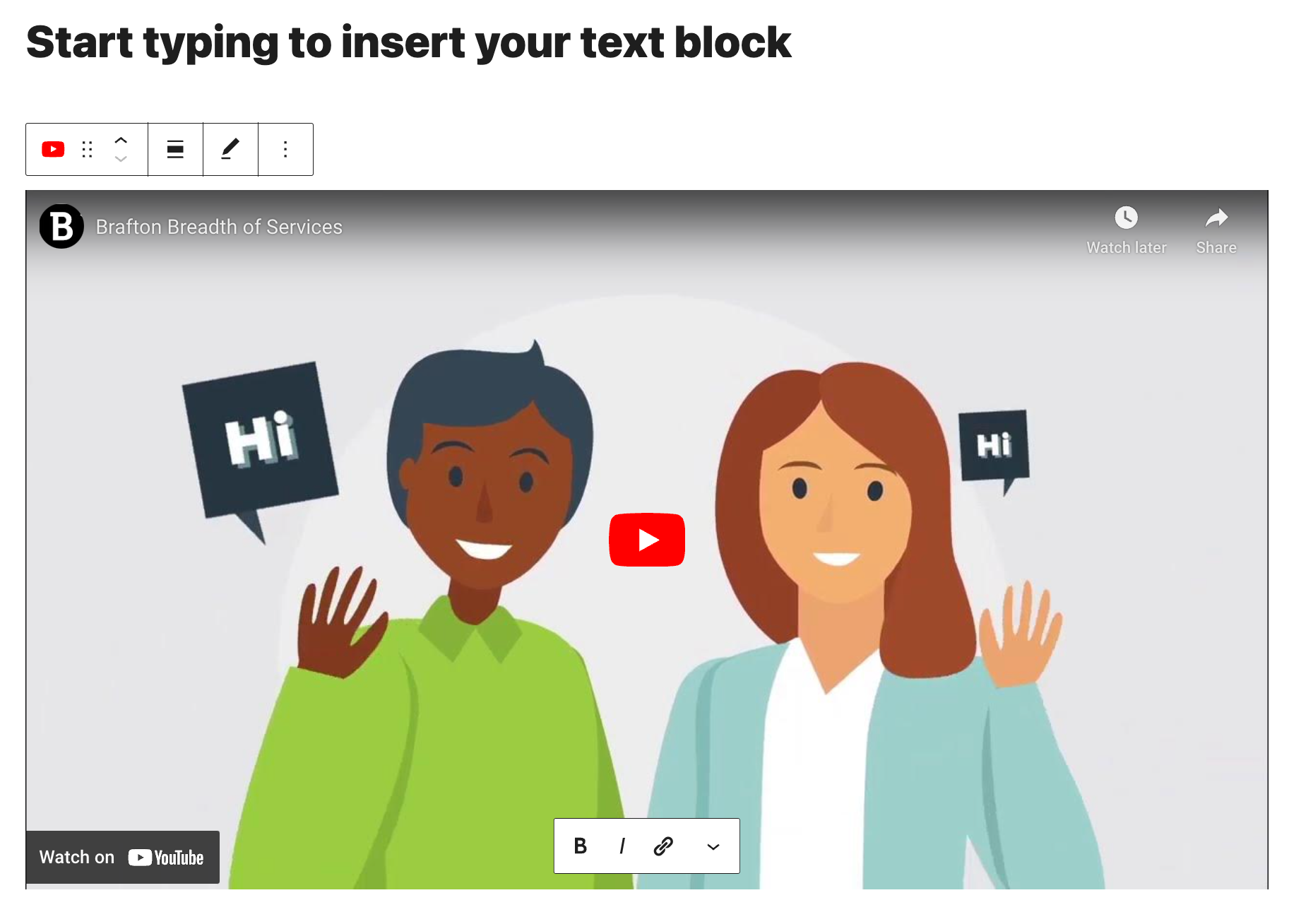
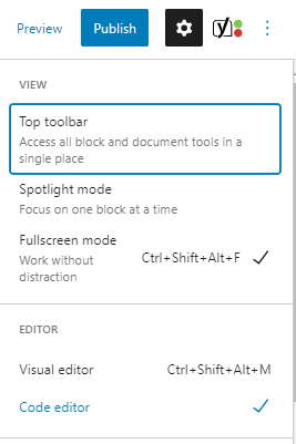
This is pretty useful for someone who used to always have to manually copy-paste HTML tags such as <a href=”link”></a> and <img src=”image”> If you like coding, then you can do that: Just select the code editor in the three dots menu on top, and you’re good to go.
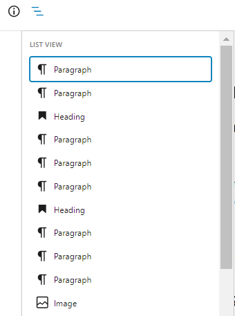
There are some features I rarely use but I know are pretty useful for others, like the details and the outline on the top bar:
Here are some things I like to do before publishing:
- Make sure that the URL slug is correct (it’ll automatically grab the title of the post, and that might not be the structure you intended to use).
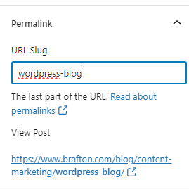
- Check if the images are full-size: This can make quite a difference once you see the post live. If your pictures have text, picking the correct size guarantees it’s readable.
- Make sure your images have alt text for accessibility.
- Confirm that the links open in a new tab and are tagged correctly.
I highly suggest using the Yoast plugin as well. It helps you see how your blog will look in search results. It shows you right away if any word will be cut off the title tag or meta description in the SERP. Not only that, but it also gives you a preview of how the featured image will appear. Simple and practical.
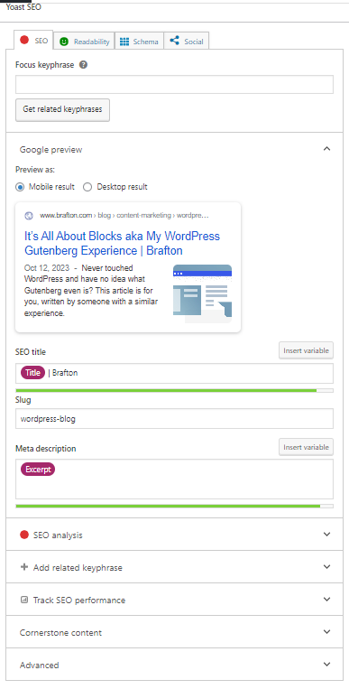
Now, how about if you want to build an actual landing page?
Subscribe to
The Content Marketer
Get weekly insights, advice and opinions about all things digital marketing.
Thank you for subscribing to The Content Marketer!
Page Building with the Block Editor
Now, page building is a very different beast. You have to have a layout already figured out to understand how that page will work, from the very first panel to the last. It’s also always good to take a quick look at the page to know what types of blocks you’ll have to create.
At Brafton, we do it like this:
- Top banner panel with the title and a fitting image with a form;
- Panels per heading switching from white to gray background;
- Client success panel featuring our best examples;
- An inline CTA of a guide, catalog or whatever fits best in that particular page;
- Other regions you can access – we’re global!
- A navy blue final panel with a CTA button.
Here’s an example of a page layout with the top panel introducing the topic, the middle panels going straight to the point on what each service offers and a bottom panel with a CTA. Simple(ish), effective and to the point.
First thing first: Always make sure to save your progress! While WordPress has an automatic saving feature, don’t rely on that, better to be safe than sorry.
Page Blocks
The blocks for building pages are pretty much the same as the blogs, but you can get more flexibility in building the page. Our tech team is excellent at this! As a non-techie myself, I’m always surprised by the miracles they create. For example, we wanted a panel showing our best infographics examples and they delivered:
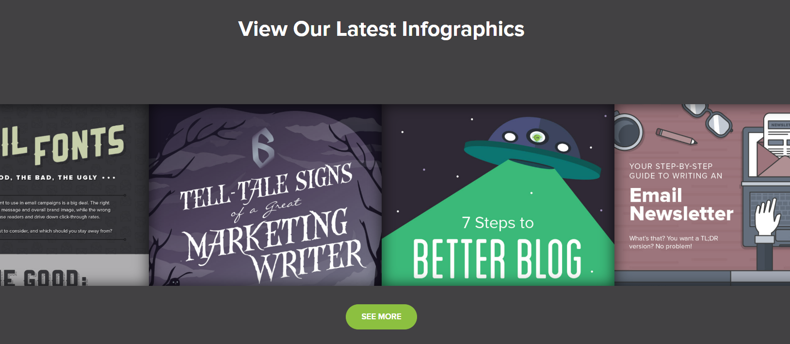
You can check out that panel here. When you hover, the colors shine through.
Here are some of my favorite panels on pages I’ve built:
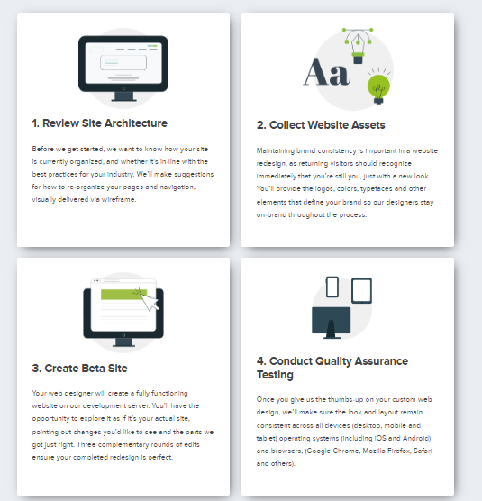
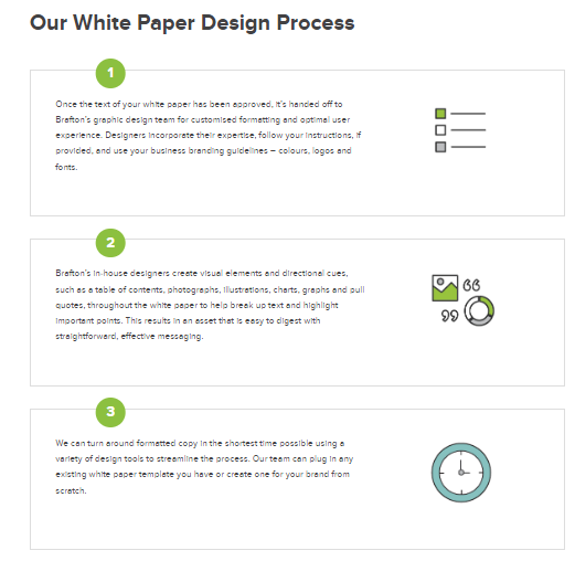
These ones are animated to highlight how a bit of movement can make a big difference to the user experience:

What’s nice is that even someone with no coding skills (like me) can still build a full page! For example, this page is just an assortment of multiple blocks.
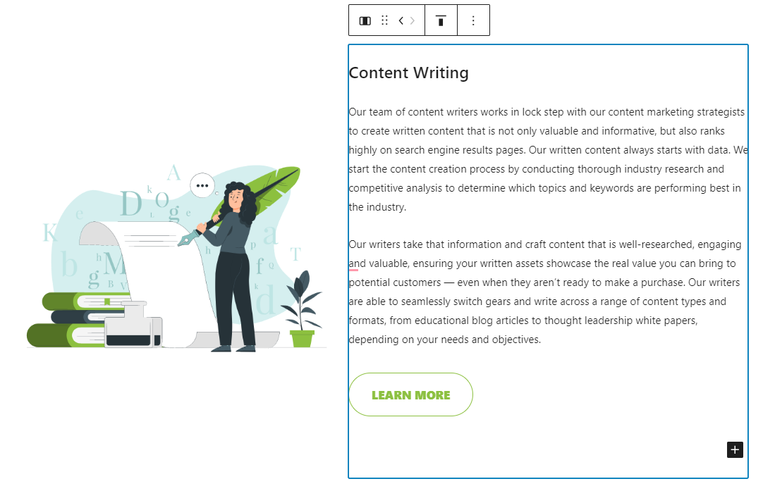
Remember how everything is just a block? This panel is a combination of a text block on the right and an image block on the left:
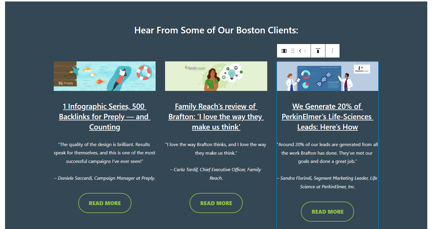
And this one? Same thing. A 3-column block, with each column containing its own 5 blocks: 1) image, 2) heading, 3) normal paragraph block, 4) paragraph block in italics and, finally, 5) a button.
The best way to get a feel for how a full page can be built block by block is just by getting into the editor and experimenting. It’s like playing with Legos but digitally.
Final Thoughts
The visual nature of the building process was a big thing that helped me when getting back to this platform and maintaining a daily schedule of publishing on the Brafton blog. If I had to do all of this with code, it’d be a robotic process and I’d 100% need to constantly check if the preview actually looked how I pictured it.
Not just me, but many people I’ve collaborated on projects with went from zero to hero on WordPress. From knowing literally nothing to building 10+ pages a week – and that’s on the low side!

I’m still learning about all these new WordPress features but it’s been a nice and fun adventure so far! It makes me want to go back to my own blogging and use it during my off-work hours too. The only thing in my way? The universal problem: lack of time.
I hope this article helped you in your own experiments. If I can do it, you absolutely can too. And now I’m off to no longer think of blocks (until tomorrow, that is).


