Turning visitors into buyers or leads has become just as important as attracting them in the first place. Sure, you might be thinking you don’t need to do anything as you are currently seeing visitors converting into leads. But it’s likely you could make the conversion process smoother and easier for the user, which ultimately means better results for you. And better results typically mean an increased profit, which can have an enormous effect on your business success and bottom line.
Now depending on your business goals, conversions can differ greatly. The action could be to download a whitepaper, sign up up for an email newsletter, make a purchase, get a quote or anything else on the site that involves taking action that will further a user down the sales funnel.
Whatever it is you want your visitors to do, this action is what you are going to measure and what you are looking to optimize. It’s time to get smarter about optimizing your conversions to ensure no new users get away!
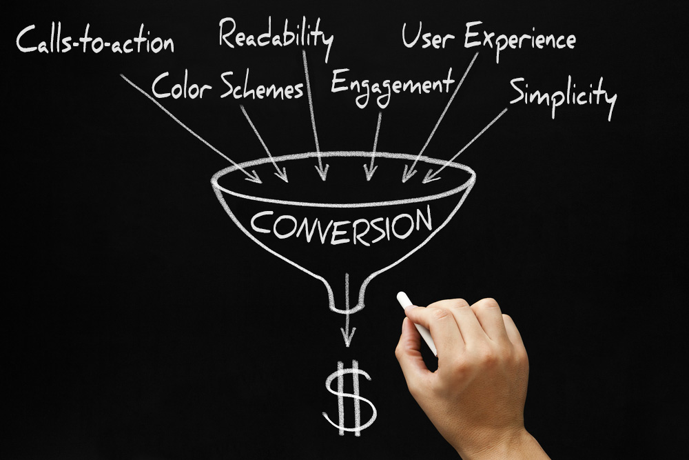
Here are six conversion optimization tips to ensure your content is efficient in furthering your audience’s journey and promoting strong conversions – from awareness, to interest, to education, to purchase, to coming back again:
1. Use call to actions – Buttons are powerful and effective, and can make or break a campaign. Promote these throughout the site, you should have a strong CTA on every page. Size, shape and color should all be taken into consideration, as they are important visual cues, but in that last second, the copy itself is what will make or break the user decisions. Avoid generic copy on the CTA like download, submit and buy now, and try using statements like: get your free e-book, get a quote, add to cart, etc.
2. Select appropriate color schemes – Less color on a site improves communication and enhances a user’s ability to locate information, too many colors can be distracting. Analogous colors work the best for website readability and creating an inviting page. Make sure you are using the correct styling to influence behavior, ie: orange is a great action color while red is the most difficult color to use and should only be used to highlight something very important.
3. Improve readability – Image, typography and size matter. Text needs to follow a specific hierarchy: Headlines should be twice the size of subheads. Large areas of text should be broken up with bullets and smaller, easier to read content. And always, always align text to the left!
4. Aim for engagement – Every customer on your site is potential business, so grab their attention from the get go! Make sure something on every page appeals to the user to lead them down the user path. Understanding your audience is key to engagement. You must know the information your customers are searching for to effectively market to them with appealing content.
5. Structure for user experience – You could be implementing all of the above, but without a properly functioning and easy-to-use website, users will leave your site running. Bottom line – if you have a confusing, ugly, outdated, slow website, people will stay away from it. Nothing is more frustrating for a user than being unable to find the information you are seeking. You can look for clues of poor UX design by doing various user testing with sites like the 5-second test and heat mapping as well as reviewing bounce and exit rates.
6. Keep it simple – This may be obvious, but is one of the most valuable tips. Remember to keep information clear concise and not cluttered. No one likes a messy house.
Now that we’ve discussed the importance of both having and promoting a strong CTA as well as optimizing your overall conversion strategy, let’s discuss the next step for success: following those leads. How you follow up with customers is equally important as getting them to perform the desired action. That follow-through is where you make money. You then need to keep the audience connected and engaged to start the process again leading them down the path to purchase. Do not think of conversions as just a dollar amount – it’s getting the user into your funnel to teach them who you are as a business so that they are eventually ready to buy. Conversions have to be thought of as a full circle – a continuously repeated cycle.
So that’s it, you know have the top tools you need to put you on track for conversion optimization. Just remember, optimization is strategic and there will always be room for improvement as your business continues to evolve.
Content marketing with blogs and infographics remains one of the most effective methods of improving conversion rate. For a look at how 51% of the conversions for an insurance company were driven from content, you can read our success story here.


