When someone thinks about a company they might want to work with or buy from, it’s usually an aspect of the company’s brand that comes to mind first.
A great brand can send qualified leads down the sales funnel, but a weak one might see prospective customers and clients sneaking out before they get serious.
Let’s look at why business branding is so important, through the lens of several branding examples that illustrate the power of a successful brand. The key takeaways from these heavy-hitting B2B and B2C businesses can serve as inspiration for organizations of all shapes and sizes.
Why is branding so important in marketing?
A brand works like a two-way street. It’s a roadmap for how you can communicate the core information about your business to customers. It’s also a path that helps prospective customers discover the heart of who you are and what you do.
In other words, it’s that piece of spaghetti in Lady and the Tramp.
If branding captures the essence of your business, marketing is the process of serving it up where customers can experience it. That could be on social media platforms, the first page of Google … or, ya know, that Italian restaurant with “Bella Notte” playing in the background.
If all goes well, your branding efforts and marketing strategy will help draw in your target audience and build a loyal customer base. Taking a strong and successful brand and amplifying it via marketing channels will help your business increase brand awareness, convert leads to customers and keep them coming back.
What are the key elements of a brand?
A brand is SO much more than a logo. As you’ll see, a lot of different elements go into creating a successful brand strategy:
The brand vision
Brand development involves distilling important but intangible aspects of your business into tangible, recognizable brand components. Therefore, you’ll need to start with those intangible things, like your company’s origin story and central mission, as well as the values you act on and your unique selling proposition.
These details help piece together a cohesive brand story and explain the who, what and why of your business. A brand positioning statement is an opportunity to articulate these intentions and what sets your company apart from the competition.
The brand visuals
A company’s visual identity is made up of components like a logo, typography, brand colors, imagery and other graphic elements. These components should work together to communicate your brand identity and tie various pieces of branded content together.
For instance, everything from product packaging and social media branding to email newsletters and event booths should share a cohesive visual style. When a prospective customer sees any one of these things, the visuals should support immediate brand recognition. Essentially, the customer should be able to associate the branded content they’re seeing with your business and what it’s all about.
A branding style guide provides guidance around using these visual elements. It can also summarize other aspects of your brand personality, such as values and voice.
The brand voice
If you’re in business, you certainly have something to say, and an audience to speak to. But how does your company convey those brand messages to your target audience? The decisions you make about how you communicate will shape your brand voice.
Voice includes the tone your business uses across written marketing materials. For instance, you might speak to your customers in a way that’s witty, intellectual or playful. It also includes the way you communicate. Whether your brand leans into emotional storytelling methods or prioritizes informative and direct language, that’s an important aspect of your brand voice.
The brand experience
Whether you operate in a B2B or B2C space, your marketing messages are still received by people. The way your business communicates through words and imagery will clue your audience into your brand personality and, by extension, the brand experience.
The entire customer journey — from the first impression to the final payment and continued engagement — is all part of your brand experience.
The initial marketing messages your customers see will help them calibrate their expectations. As they research and use your products or services, they’ll see how closely your business lives up to that brand promise. And, when they reach out for help, the quality of customer service will speak volumes about your brand.
5 powerful branding examples and what we can learn from them
Let’s take a look at branding strategy in action with these B2B and B2C branding examples:
1. American Express
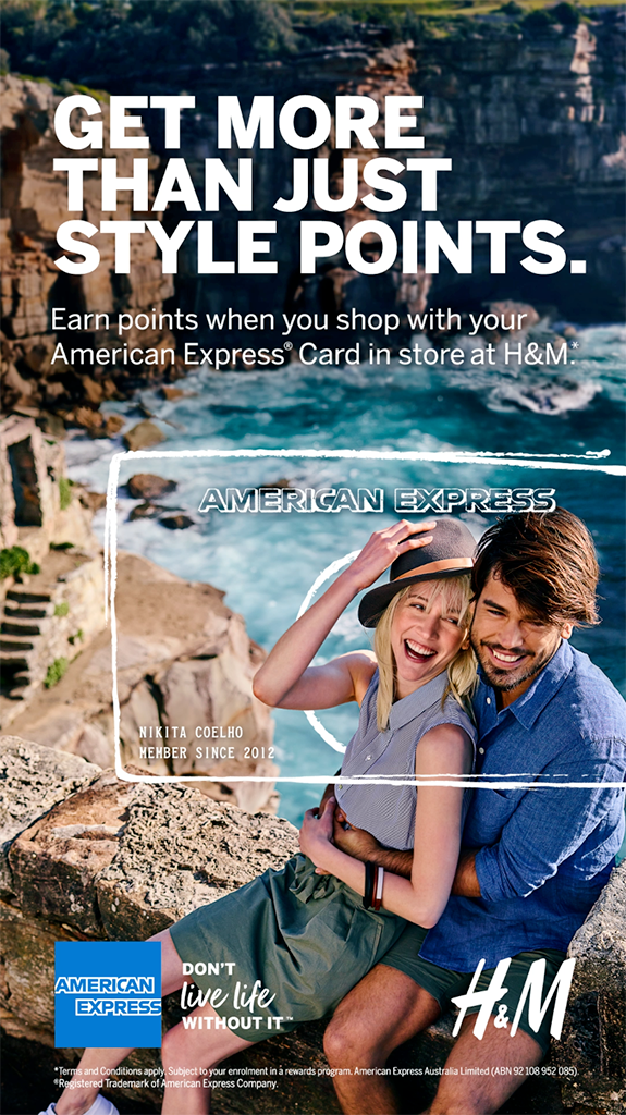
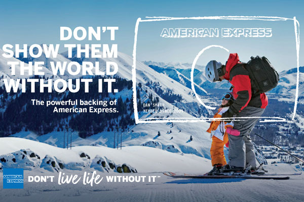
Despite being in business for 170 years and counting, American Express hasn’t let go of its advertising roots. Much of AmEx’s current brand is rooted in a slogan popularized by the credit card company in the 1970s and 1980s: “Don’t Leave Home Without It.”
If you think about it, the central message in this nostalgic clip is really no different from the American Express brand message of today.
Rather than segmenting its target audience into a consumer group and a business audience, AmEx largely considers them one and the same, crafting messages that hint at how the company can fit neatly into all sides of the work-life balancing act.
It emphasizes the glamour and excitement of travel and cosmopolitan life, for both business and pleasure. It also references the joy of spending time with family. Plus, as the creator of Small Business Saturday® and Shop Small®, AmEx stands behind locally owned businesses in an effort to earn the trust of owners and consumers alike.
Takeaways
- It doesn’t matter whether AmEx is marketing consumer-grade products or business resources; the company always speaks directly to people.
- For decades, American Express has crafted its branding efforts around a straightforward and memorable message.
- Variations on this message help the brand show its value in different contexts.
2. City of Chicago
It might be hard to believe that the home of the best city flag could fall into the trap of sloppy branding. But Chicago officials felt that the city’s distinctive character was becoming obscured by a jumble of agencies, programs, services and other initiatives, each with its own visual identity.
Enter the Chicago Design System.
With this new and innovative municipal branding effort, entities across the city are now united through instantly recognizable visuals that draw inspiration from the iconic Chicago flag. A custom typeface called Big Shoulders captures the spirit of the city while presenting a clear and concise message.

Upon the March 2020 reveal, Mayor Lori Lightfoot said the rebrand initiative “marks a milestone in ensuring everything we create aligns with our values as a City.” That’s good branding in a nutshell.
The streamlined look and feel of the Chicago Design System is slated to cut costs and eliminate inefficiencies while promoting accessibility and improved brand recognition for Chicago neighbors around the corner and visitors from around the globe. Moreover, the City has made its branding examples, guidelines and templates available online so that local businesses and residents can showcase their connection to Chicago with just a few clicks.
And yes, there’s even guidance on how to make sure your new Chicago star tattoo is 100% accurate.
Takeaways
- When it comes to branding a large and unwieldy entity, or even a small operation, consistency is the key to success.
- If it’s time to develop a more sophisticated and streamlined brand, start with the existing culture, values and imagery and see where they lead.
3. Fenty Beauty
When Rihanna’s eponymous cosmetics line launched in September 2017, it was an instant hit.
Of course, Rihanna’s fame and Fenty Beauty’s powerful parent company, LVMH, certainly played a part in the beauty brand’s success. But not all celebrity makeup launches take off straight away.
What set Fenty Beauty apart was its commitment to carrying out its global brand promise, “Beauty For All,” from day one.
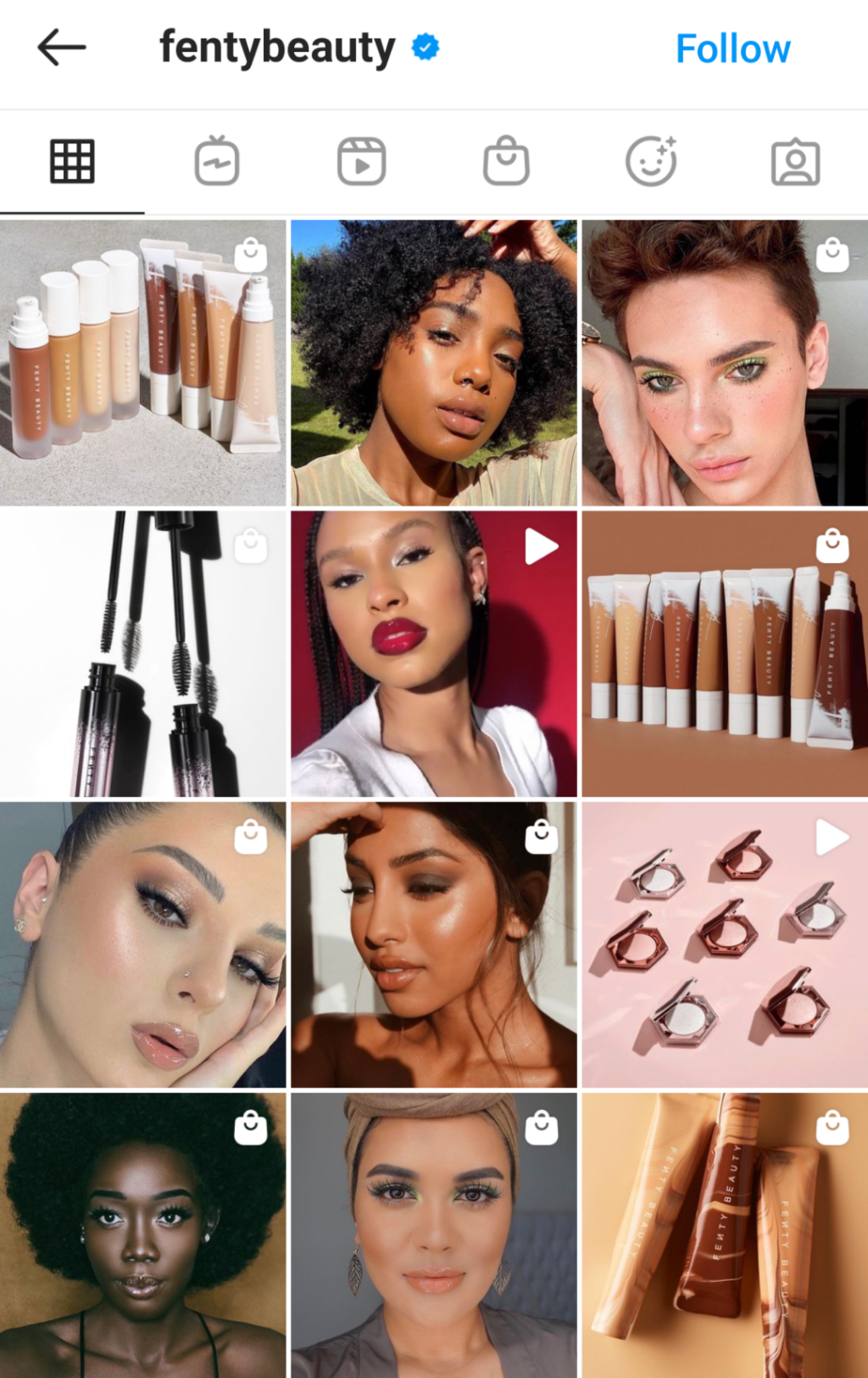
The cosmetics line launched with 40 foundation shades for customers of all skin tones. And it was clear that diversity was a core value, not an afterthought. Product branding and promotional photos consistently feature a more diverse group of models than what’s typical of mainstream beauty brands.
“The first time we showed the Fenty Beauty campaign trailer internally, a room full of business leaders, including myself, got very emotional,” recalled Sandy Saputo, chief marketing officer at LVMH’s Kendo Brands. “It was the first time underrepresented, underserved women and cultures were featured in a global prestige beauty campaign.”
Beauty consumers and industry leaders quickly took note, and the brand racked up $100 million in sales in just a few weeks.
But, as Saputo noted, Fenty Beauty “never once used the word ‘inclusive’ in our messaging.” Instead, the company earned its high brand equity by putting inclusive marketing into action and actually showing buyers and the beauty industry what that looks like.
A wider range of consumers can see themselves in the Fenty Beauty brand, but that’s not the only reason it’s relatable. Across social media, branding examples like tutorial videos, memes and user-generated content show that the makeup company speaks with a brand voice its young follower base can connect with.
Takeaways
- The most effective way to communicate your core brand values to your target audience is to show, not tell.
- An inclusive marketing approach can resonate with audiences that have a significant market value but that are often overlooked.
- Speaking your customers’ language can help foster meaningful, long-term relationships.
4. Mailchimp
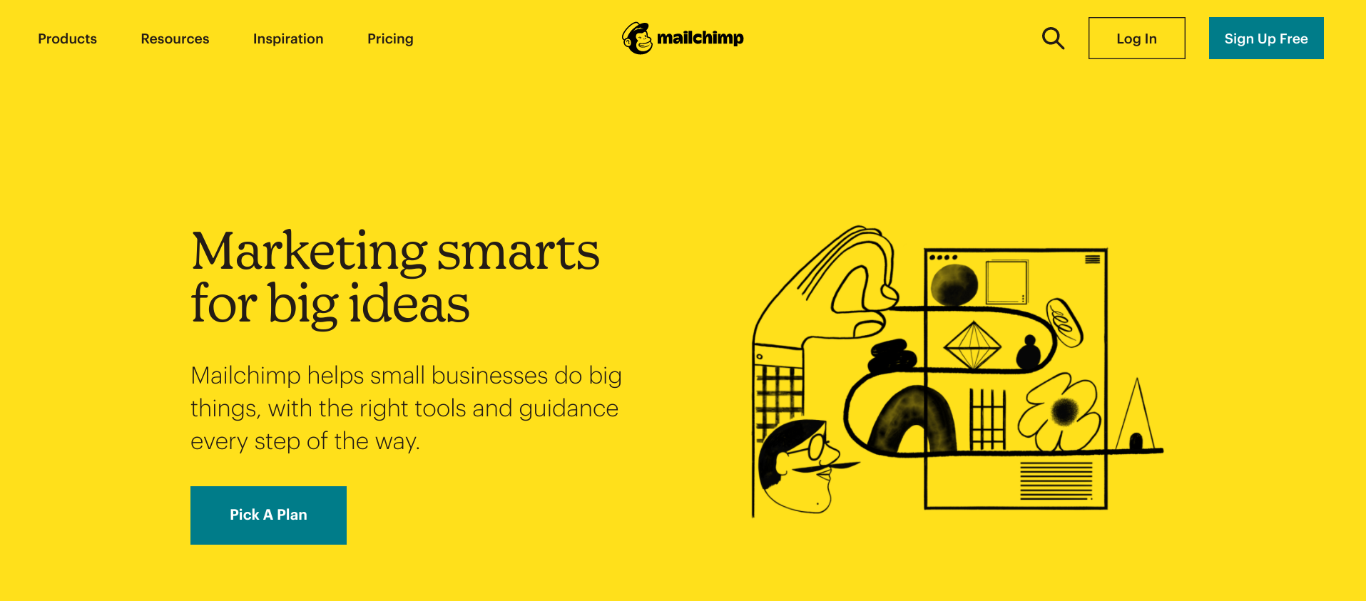
After launching in 2001 and eventually taking the email marketing world by storm, Mailchimp made the decision to refine its brand in 2018. But, unlike other tech companies that marked their maturity with more serious and austere brand identities, Mailchimp kept it quirky.

The company stuck with Freddie the Chimp as its playful logo and a sunny yellow brand color. It also spruced things up with an array of expressive, dynamic and kinda weird illustrations with an intentionally unrefined, doodle-y feel.
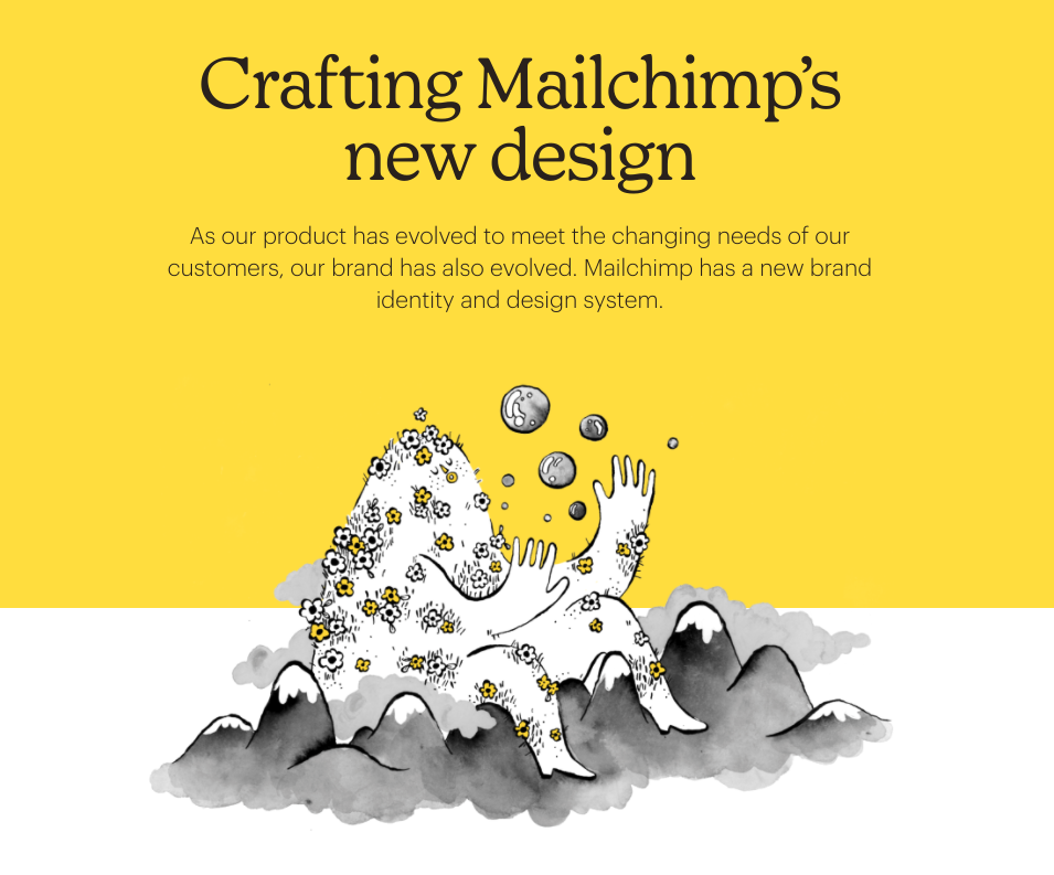
In its written content, Mailchimp strikes a balance between being authoritative and approachable. The company’s branded resources present information in a clear and concise way. But ideas are always expressed with a friendly tone and a healthy dose of humor.
Why does this odd combination work so well?
It’s because Mailchimp’s clients know a thing or two about taking creative risks. Small business owners and marketers use Mailchimp’s branding tools to put their own ideas out into the world and make an impact. This target audience can appreciate a partner that unapologetically embraces its brand personality, since that’s what small business leaders are trying to do, too.
“Ultimately, the goal is to make Mailchimp a beacon for its own customers, who are growing brands trying to figure out how to speak to their people,” Angie Shih, a strategist at Mailchimp’s branding agency Collins, told Fast Company. “[They’re] hoping to send a message to these companies that success doesn’t mean erasing your peculiarities and idiosyncrasies. It’s about amplifying them. That’s how you stand out and connect with everyone.”
Takeaways
- Corporate branding doesn’t need to be boring! A brand personality that stands out for all the right reasons will be a lot more memorable.
- If your business operates in a B2B space, consider how you can use your brand to lead by example and galvanize your audience.
5. SpaceX
A lot of leaders in the aerospace industry have pretty strong brand identities. After all, companies that make fighter jets and rocket ships — or fearlessly launch them into the outer atmosphere and beyond — already have some pretty powerful brand fuel to work with.
But there hasn’t been anything quite like SpaceX before.
From a visual standpoint, the SpaceX brand fulfills the space travel experience we were promised by Space Age designers in the 1960s.
Stark white surfaces are interrupted only by clean lines and contours. All the inner workings and the advanced technologies are completely hidden away behind attractive touchscreens. From the sleek spacecraft design and the aesthetics of the capsule interiors to the details of the astronauts’ uniforms, the overall effect is impossibly cool.
The control panel consists of three touchscreen displays, which allow the crew to operate and fly the vehicle manually if needed pic.twitter.com/78qDepdaSW
— SpaceX (@SpaceX) November 16, 2020
Of course, this was all very intentional. And it required some outside-the-box thinking.
For instance, rather than approaching traditional military uniform contractors for design help, SpaceX called up Hollywood superhero costume designer Jose Fernandez. The end result — streamlined suits enhanced with wearable technology — have been likened to tuxedos for space.

Elon Musk’s manufacturing and space transportation company is built on values like excitement, optimism and sheer determination. As a result, branding examples from SpaceX are tangible reflections of these values.
Importantly, the brand looked back to understand what we as a society wanted space travel to be. From there, it worked to bring that to life in a way that’s better than what folks in the JFK era could have imagined.
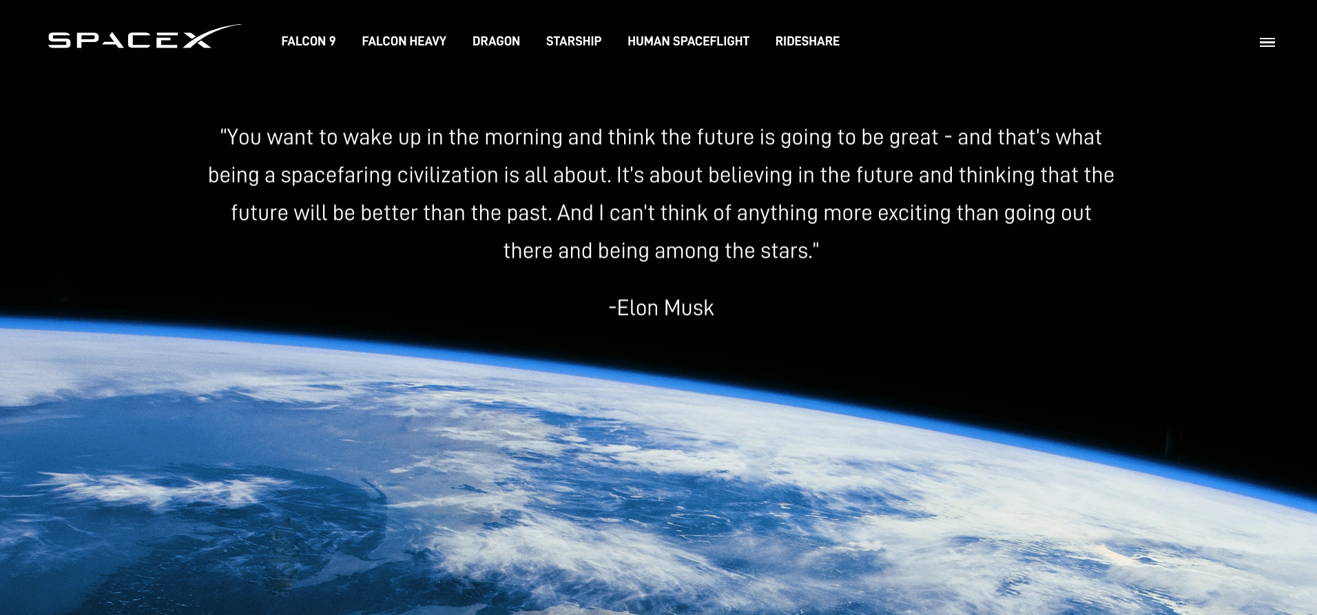
To cite Musk’s quote from the SpaceX website, “It’s about believing in the future and thinking that the future will be better than the past.”
Takeaways
- Spend some time tapping into your audience’s wildest dreams, then consider how your brand can make them a reality.
- If you have an innovative vision for your brand, don’t be afraid to reach outside your industry or comfort zone to find partners who can help you realize it.
Building a brand that leaps off the page
If you simply go through the digital marketing motions, your brand won’t exactly make waves.
All of these leading businesses we’ve looked at took a stance. They checked in with their values and vision, then found ways to translate those into tangible, meaningful brand identities.
That’s something you can do, too.
Figure out what makes your audience tick, then tailor every brand message around that. Align your content marketing strategy with your company’s core values. Stay true to your brand personality in a go-big-or-go-home way.
After all, you have to come up with something. So why not build a brand we can all get excited about?


